365 with harrychang.me: On Whims, Rebellion, and Owning a Corner of the Internet
Date
April 12, 2026
Tags

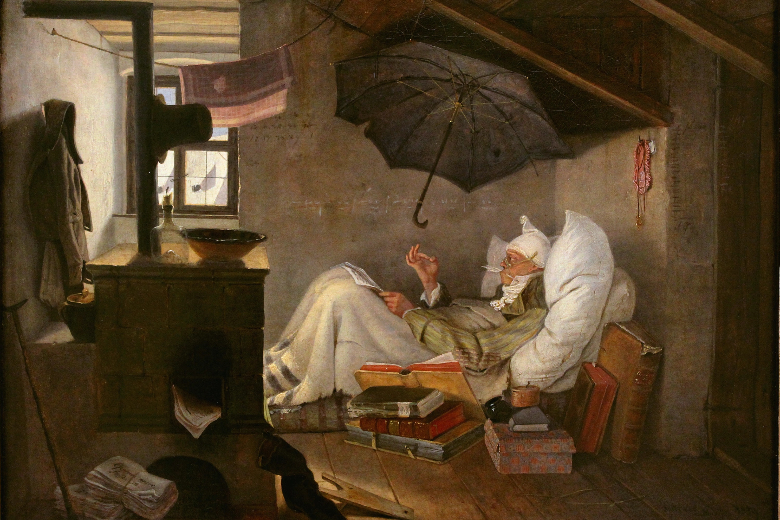
365 days ago, I missed a mountain and built a website instead. On absence, imitation, and learning to build around the gaps.
The Mountain I Didn't Climb
April 7th, 2025. My classmates were packing for Mount Dabajian, a four-day trek through Taiwan's high country. A rite of passage. The kind of trip people remember decades later.
I was packing nothing.
A collapsed lung the year before meant I couldn't risk altitudes above 2,500 meters. Doctor's orders. Non-negotiable. So while everyone else was preparing to climb, I was preparing to cope with staying behind.
Loneliness has a particular texture when it's circumstantial. You're not upset at anyone. You're not even upset at the situation, exactly. You're just alone in a way you didn't choose, with four empty days stretching ahead and not much plan to fill them.
My classmates' group chat kept pinging with gear checks and weather updates. I muted it. The room was too quiet. I opened YouTube and let the algorithm do what it does, which is how I ended up watching portfolio breakdowns at 2am, clicking through timestamps, pausing to squint at spacing I couldn't name yet.
I filled those days by watching too many portfolio videos.
One from Joseph Zhang absolutely wrecked me. Three columns. Editorial precision. The kind of minimal alignment that looks effortless and probably took months. I watched it twice, then opened Figma, then imported his entire site just to stare at how things lined up.
By April 13th, I had a working website.
Six days. From nothing to deployed. From loneliness to something I could point at and say: this exists because I made it exist.
I'm not sure "coping mechanism" is the right term. But I'm not sure it's the wrong one either.
The Theft
Let me be honest about how the first version came together: I stole it.
Not maliciously. Not completely. But the process was less "original creation" and more "aggressive inspiration." I imported Joseph's site into Figma, fed the Figma file into Vercel's v0, and watched it spit out a general working layout. The three-column structure that still anchors my About section? That's his. I liked it too much to move on from it.
Everything after that first day was mine. But the foundation was borrowed. The scaffolding was someone else's blueprint.
I think people don't talk about this enough. The creative process, especially in web development, often starts with imitation. You see something that works. You figure out why it works. You rebuild it until you understand it well enough to deviate. The deviation is where originality lives, but the imitation is where learning happens.
The first feature I built that felt genuinely mine was the image framing engine. I've always loved white frame lines around photographs, but I hated how vertical images get more visual real estate since they have to scale their width to match horizontal ones. So I made a system for desktop. Skeleton loaders for the initial render. Full image load with consistent frame lines regardless of aspect ratio. It took longer than it should have, mostly because optimizing for Largest Contentful Paint is genuinely hard, even with Gemini helping.
That skeleton system still haunts me a little. Both the logic and the performance tuning pushed me further than I expected. But when it finally worked, I felt like I'd earned something.
What Changed, What Stayed
A year is long enough for a website to become unrecognizable. Mine didn't.
The evolution happened in layers. First came internationalization, a client-side React Context switching between English and Traditional Chinese. Then the blog section, which required rethinking how content was structured and rendered. Then the Turborepo refactor, an architectural overhaul designed to share components across applications and lay the groundwork for my sister's portfolio. Her portfolio, for the record, remains firmly unfinished, which is perhaps proof that building the infrastructure is always more exciting than building the thing itself. Most recently, the heading font shifted from Space Grotesk to Artific Variable, a typeface from Powertype foundry that lands somewhere between Swiss precision and actual personality. The kind of change that takes ten minutes to implement and three weeks to stop second-guessing.
The technical details matter to people who care about technical details. (For a full breakdown of the stack, see the project entry). For them: a 100 Real Experience Score on Vercel, both desktop and mobile, even under 4,000 visitors in 24 hours. FCP around 1.55 seconds. LCP around 1.66 seconds. CLS at 0.01. I spent enough late nights on these numbers that they feel less like metrics and more like souvenirs from arguments I had with Chrome DevTools.
But the numbers aren't the point.
What stayed the same matters more. The three-column layout. The lack of a hero section. The long paragraphs that refuse to be skimmed. The hidden details, the Spotify integration in the footer, the guestbook tucked away, the custom 404 page that asks you to "focus" a rangefinder to escape. These were deliberate choices over the year. They're still deliberate choices now.
I call this site "a project forever unfinished." I used to say it apologetically. Now I say it as a statement of intent. Completion was never the goal. The site grows as I grow. It changes as I change. The unfinished-ness is the feature.
Before I Joined the Conversation
Here's what I didn't expect: the site would speak for me in rooms I hadn't entered yet.
Earlier this year, I cold-emailed a professor whose research I admired. The kind of email where you're asking for fifteen minutes of someone's time and hoping they don't just archive it. I included my URL at the bottom, almost as an afterthought.
They replied the same day. When we met, the conversation shifted immediately. Instead of me explaining who I was, the site had already done it. The projects. The blog posts. The gallery. Less interview, more mutual discussion. Less "prove yourself," more "tell me more about this."
A PDF resume could have listed the same accomplishments. But a resume is a form you fill out. A website is a space you build. The difference is felt, even if it can't be measured.
I've used the site for tutoring inquiries too. I posted an offer in a Facebook group—nothing elaborate, just outlining what I could help with—and watched the site handle the rest. That single post drove over 4,000 visitors in 24 hours, the spike I mentioned earlier. Some came for the technical specs. Some came for the blog posts about film or photography or plushies. The site offers something for everyone without forcing everyone to care about the same thing.
It establishes who I am before I even join the conversation. That's not a small thing.
The Quiet Rebellion
I've started thinking of this site as a form of resistance. Not dramatic resistance. Not manifesto-on-the-homepage resistance. Just a quiet refusal to build the way everyone expects.
No hero section. No splash screen. No scroll-jacking. No TL;DR summaries at the top of long posts. No algorithmic optimization for clicks.
Instead: intent-driven navigation. Long paragraphs for those willing to read them. Hidden details for those who stay. The desktop Spotify hover that most people never notice. The guestbook that requires scrolling to find. The manifesto buried in the desktop footer, invisible on mobile.
This is filtering. I know it's filtering. The site is designed to reward attention and patience, which means it's also designed to lose people who don't have either. Some would say that's a mistake. Some would say I'm excluding people I might want to reach.
Maybe. But the people who do stay, who do read, who do find the hidden corners, they reach out. They mention the click sparks. They sign the guestbook. They ask about things I wrote months ago. The filtering works in my favor, and it's non-negotiable.
There's something else, too. The act of building a portfolio forces synthesis. It forces you to decide what matters, what to show, what to hide, how to present yourself to strangers who might become something more. Outside of the practical utility in interviews or applications, there's something valuable about that process itself. You have to think about who you are. You have to make choices about how you want to be known.
That's rare. Most platforms don't ask you to synthesize. They ask you to perform within their constraints. LinkedIn gives you a profile picture slot and a headline and a list of jobs. Medium gives you an algorithm to chase. The forms are pre-built. You just fill them in.
A personal site has no form. You build the form. And in building it, you discover what you actually want to say.
Why You Should Have One
I'm not going to tell you to build a website. That's not really my place. But I can tell you what having one did for me, and you can decide if any of it applies.
The practical arguments are obvious enough that I won't dwell on them. A portfolio demonstrates competence in ways a resume can't. It gives you a URL to share. It makes you googleable on your own terms. Fine.
The less obvious argument is this: owning a corner of the internet is meaningful in itself.
We rent so much of our digital presence. Instagram owns your photos. LinkedIn owns your professional identity. Medium owns your writing, or at least the context around it. These platforms can change their algorithms, their terms of service, their entire business models, and you have no recourse. You're a tenant, not an owner.
A personal site is property. Small property. Insignificant property in the grand scheme of things. But when I write a blog post here, I'm not thinking about engagement metrics or trending topics. I'm thinking about whether I said what I wanted to say. Whether the paragraph lands. Whether the photograph belongs.
That's the difference between renting and owning. Not the control, exactly. The quiet.
For Those Who Want to Try
If you want the specifics: I develop locally in VS Code, write in Obsidian, deploy through Vercel's free tier, and check Google Search Console when I remember to. No dashboard. No database CMS. Everything lives in Markdown files, version-controlled in Git. This works for me because I'm comfortable with code and allergic to dashboards.
If you're not, Framer is probably the most customizable no-code option. Notion as a website is interesting too, especially if you want to focus purely on text. I've never used either personally, so take that recommendation with appropriate skepticism.
The tool matters less than starting. "Readiness" is a post-hoc analysis anyway. You only realize what you would've done differently after going down the rabbit hole. The site will teach you what it needs to become. Assume you're ready, even if the assumption is naive. Especially if it's naive.
The Gap That Remained
One year ago, I couldn't climb a mountain with my classmates.
One year later, I'm still not sure whether I missed something important or found something better. Probably both. The trip would have been memorable. The friendships would have deepened in the particular way that shared physical challenges deepen things. I'll never know what conversations happened at altitude, what jokes became inside references, what moments bonded people in ways I wasn't part of.
But I have this. A website that grew from loneliness into something I'm proud of. A space that speaks for me. A corner of the internet that's mine.
The mountain is still there. I'll probably climb it someday, lungs permitting. It won't be the same trip. It won't recover the jokes I missed or the bonds I wasn't there to form. That gap closed without me in it.
Some gaps close without you. You just build around them.
Acknowledgments
- Title image: Der arme Poet by Carl Spitzweg, Public Domain, Link. The poet makes his garret into a world. Not despite the leaking roof and the cold, but inside them. Some corners of the internet begin the same way.
- Design inspiration from Joseph Zhang, whose three-column layout I borrowed and never gave back
- Source code available on GitHub under CC BY-NC 4.0
- Built with Next.js, React, TypeScript, TailwindCSS, and an unreasonable amount of stubbornness